
miles to smiles
Tapping into Wellness: A Pocket-Sized Powerhouse
Microsoft Hackathon | Fall ‘26
Author
Timeline
2 Months
Isabel Zhou, Lead Artist
Danny Cha, Artist
Figma
Miro
Tools used
My role
Product Strategy
User Research
Product Design
Usability Testing
Background
During my later years of college, I struggled heavily with bulimia in my day-to-day life as a result of several severe weight cuts throughout my competitive powerlifting career. As I transitioned from being an athlete to a coach, I began to understand the importance of proper nutrition as a driver of both physical performance and mental well-being. Through my work with Ms. Zhou, we began exploring how these lessons could be translated into something accessible to young people in underserved communities. Our realizations were two-fold:
Nutrition as Empowerment: Our coaching philosophy centered on nutrition as a long-term empowerment strategy, rather than a short-term diet. Through coaching, we witnessed how tailored nutritional strategies could improve athletes' physical capabilities, confidence, and mental resilience. Isabel and I wanted to make these insights accessible to children in underserved communities as well, particularly those facing misinformation and limited access to nutritional resources.
Accessible Technology as a Bridge: We recognized that, despite financial barriers, the widespread availability of smartphones and modern digital connectivity could help equalize access to health and nutrition education. Together, we saw mobile technology as an opportunity to bring practical, trustworthy nutritional knowledge to children and families in low-income communities.
Understanding these gaps, Isabel and I set out to develop a mobile application that could translate evidence-based nutritional strategies into an actionable and engaging learning experience for children in underserved communities, using technology to make health education more accessible in an increasingly digital world.
market Research
To kickstart the research process, Isabel and I examined multiple publications to better understand the interconnected nature of wireless technology and its potential to expand access to information.
Research by Jensen suggests that our mobile application will be accessible to children, even in low income communities, due to the high prevalence of smartphones
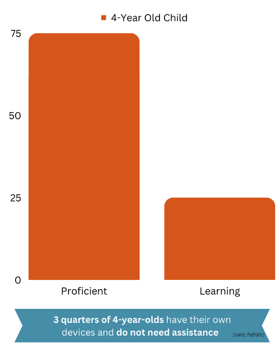
Data from Kabali et al. reflects a mobile app being easy to use for MilesToSmiles' target population: younger children
The data collectively highlighted the accessibility of mobile technology and the readiness of youth to engage with mobile applications, making a compelling case for a nutritional engagement application as a viable tool for promoting healthy lifestyles in underprivileged areas.
Kabali et al., 2015.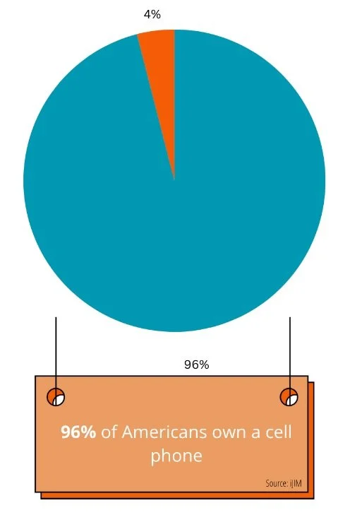
Jensen, 2015.Design Research
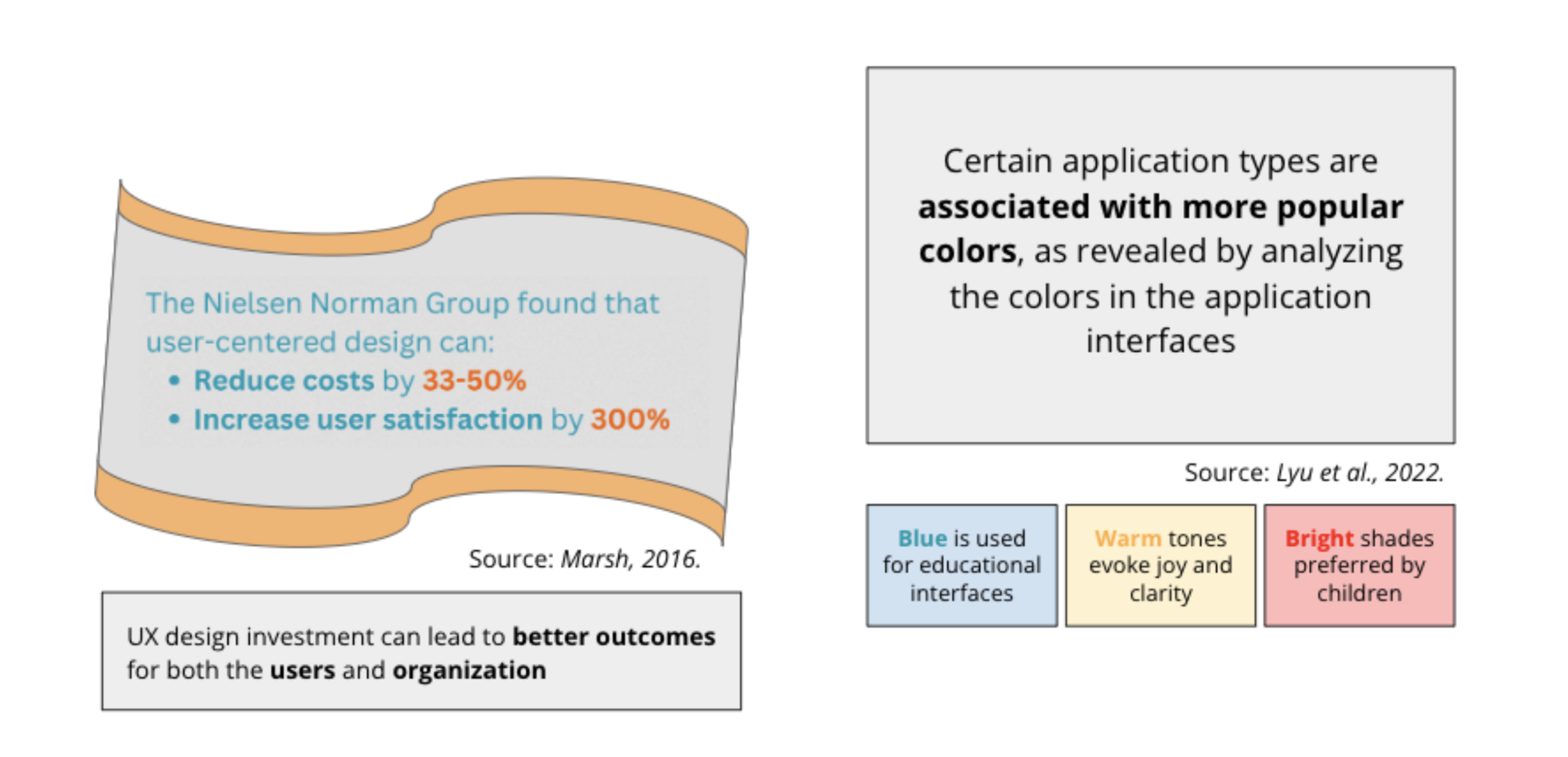
Additionally, we compiled research on powerful design principles for younger audiences, focusing on implementation costs and age-specific color choices for different interfaces.
These insights underline the importance of thoughtful design and color use in creating an effective and engaging app interface.
Persona + journey mapping
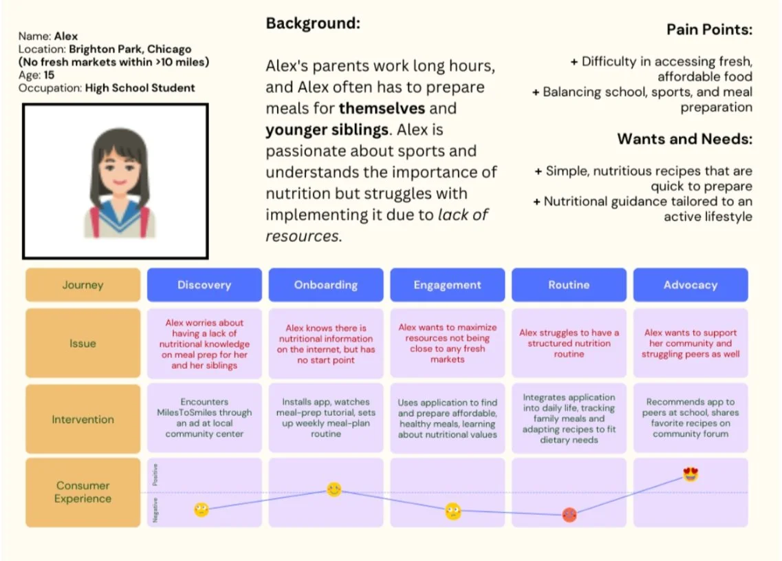
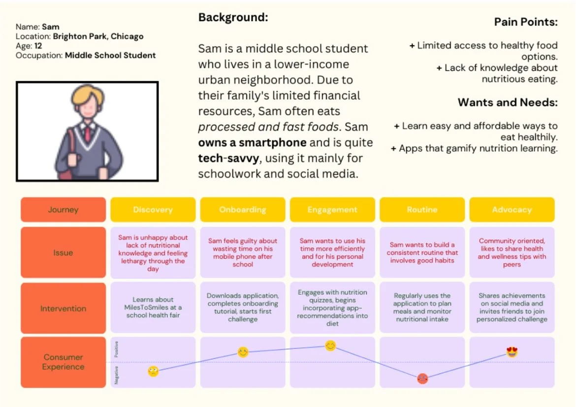
Next, in order to gain perspective on the multitude of factors contributing to malnutrition, I conducted 5 interviews with families from Brighton Park, Chicago to give me a better understanding of pain points with healthy lifestyle habits. I then created the following user personas and journey maps to demonstrate pain points and frustrations from my primary audience.
Meet Alex:
Meet Sam:
wireframes
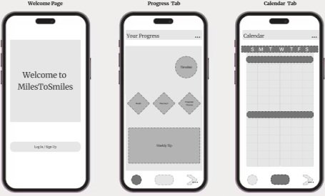
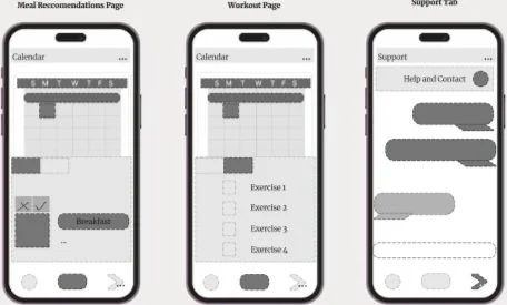
To begin the design process, Isabel created 6 screens using FigJam to explore different components of the app from a child’s perspective, ranging from the ‘Welcome’ page to the ‘Support’ tab. She focused on creating an intuitive design to emphasize the child’s progress screen-to-screen.
Usability testing
Using printed paper prototypes of my wireframes, Isabel and I used Miro to conduct usability testing with the same families we had interviewed previously. We used guiding questions to transition participants from “screen” to “screen” in a way that felt intuitive and sequential, while documenting feedback and notes for both future revisions and successful design elements.
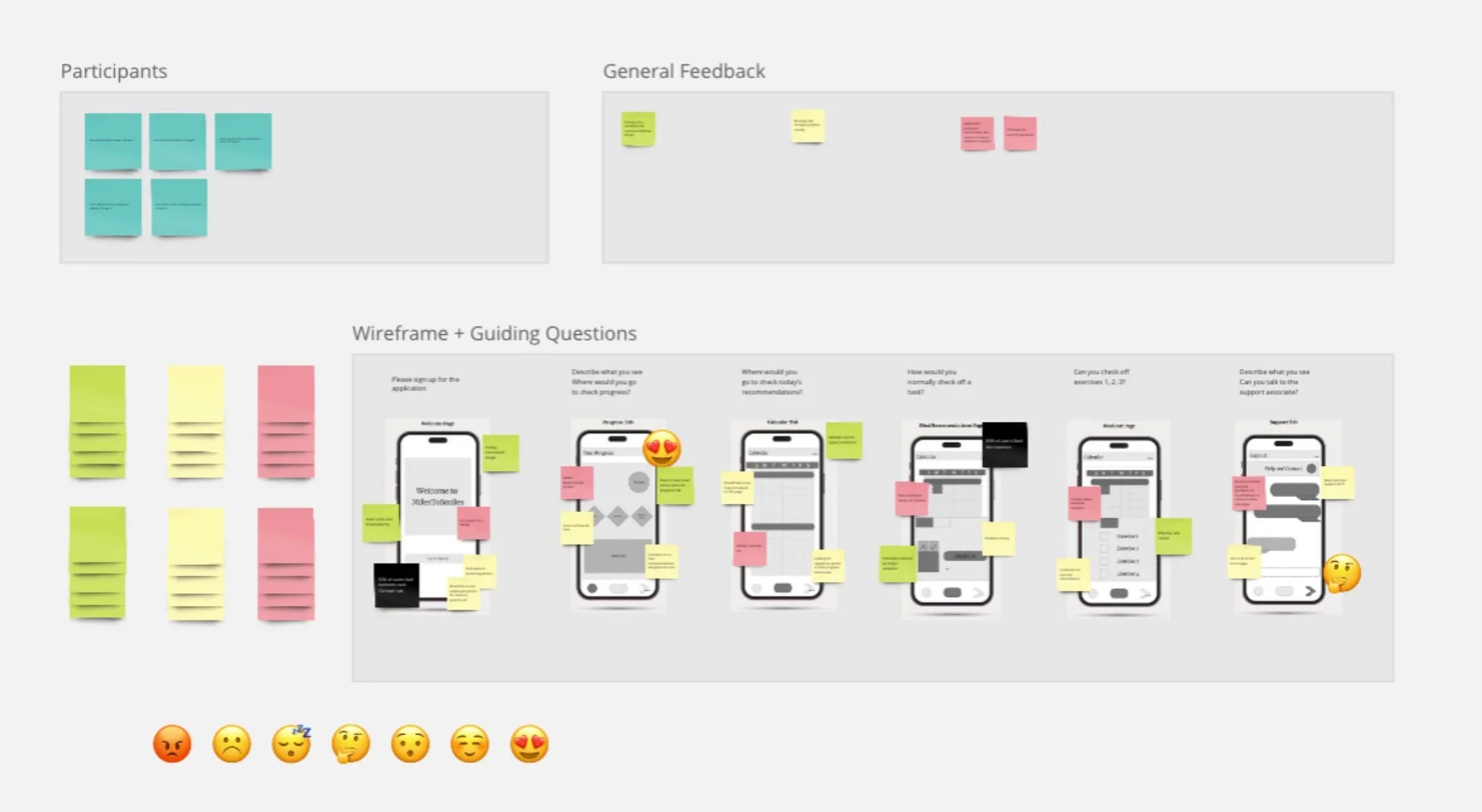
After conducting initial testing, users expressed interest in additional in-app support for children, including parental guidance and access to nutritional and health experts. In accordance with the user journey, Isabel and I identified children in primary education as the primary users of MilesToSmiles, with parents and mentors serving as secondary users to help reinforce a structured routine.

high fidelity prototype
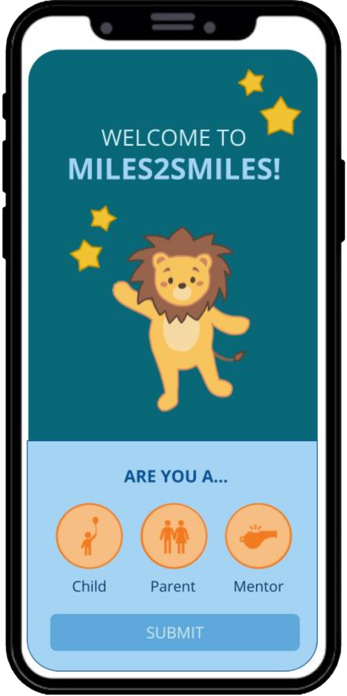
INTRODUCTION
Child

Parent

Mentor

Logo

Mascot


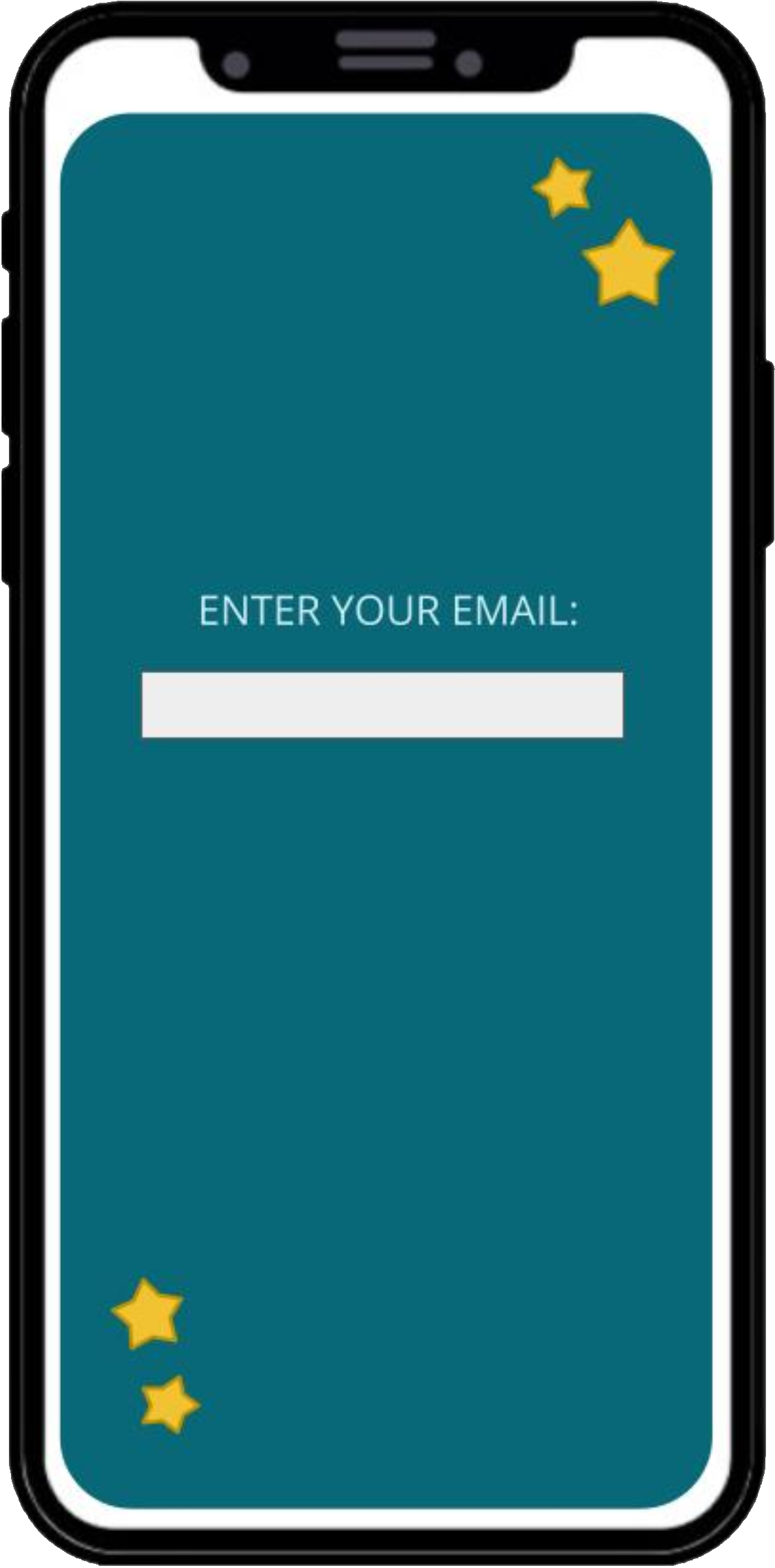
Child, Parent, and Mentor accounts will be linked via email.

progress Tab
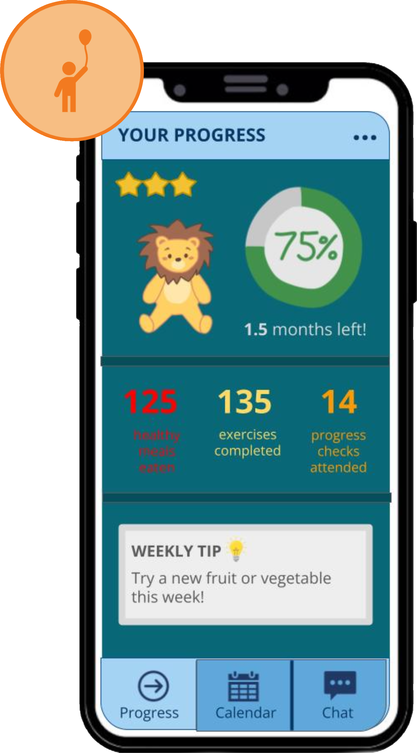
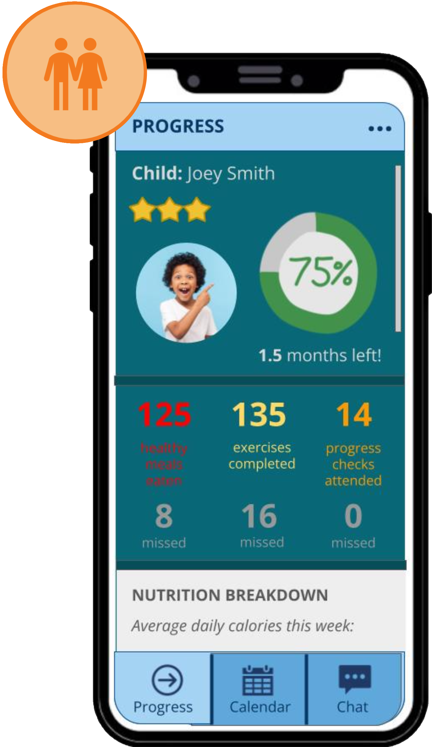
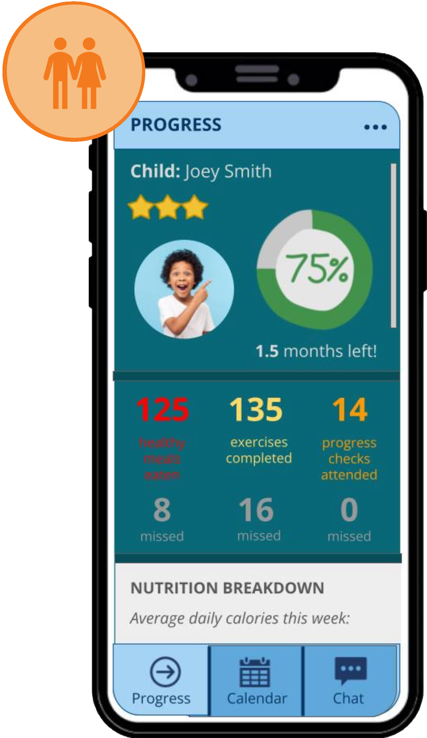
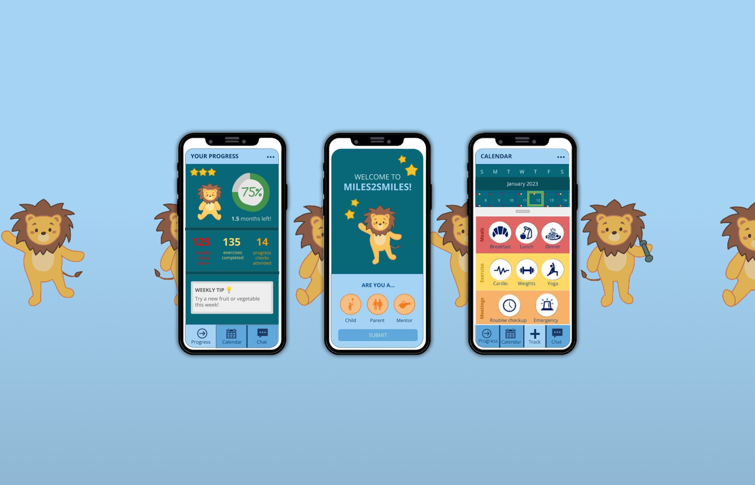
Once logged in, the progress tab will serve as the home page when the app is opened
Compared to the Parent and Mentor, the Child progress tab is simpler and focuses more on positive progress

Calendar tab - same for Child, Parent, and Mentor
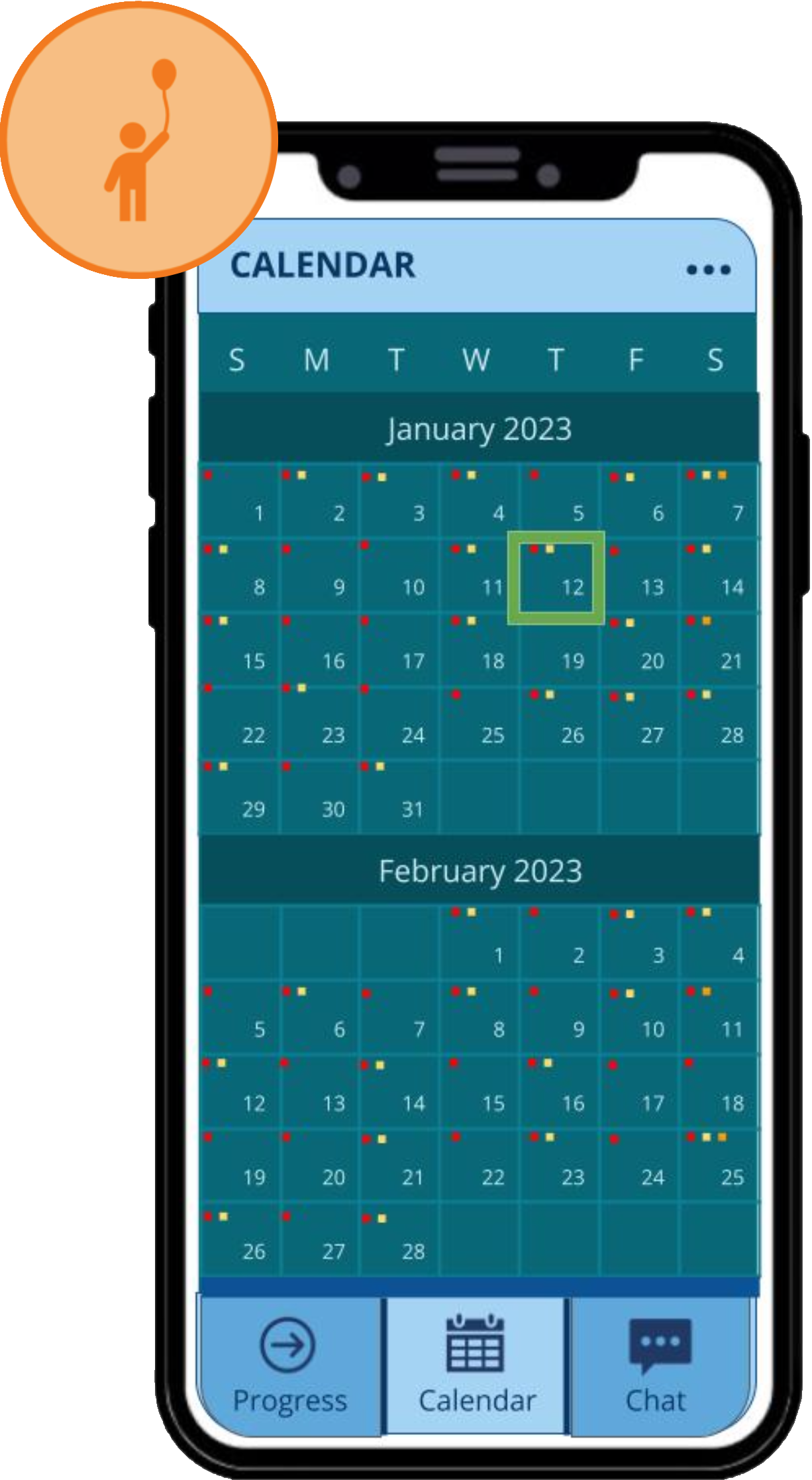
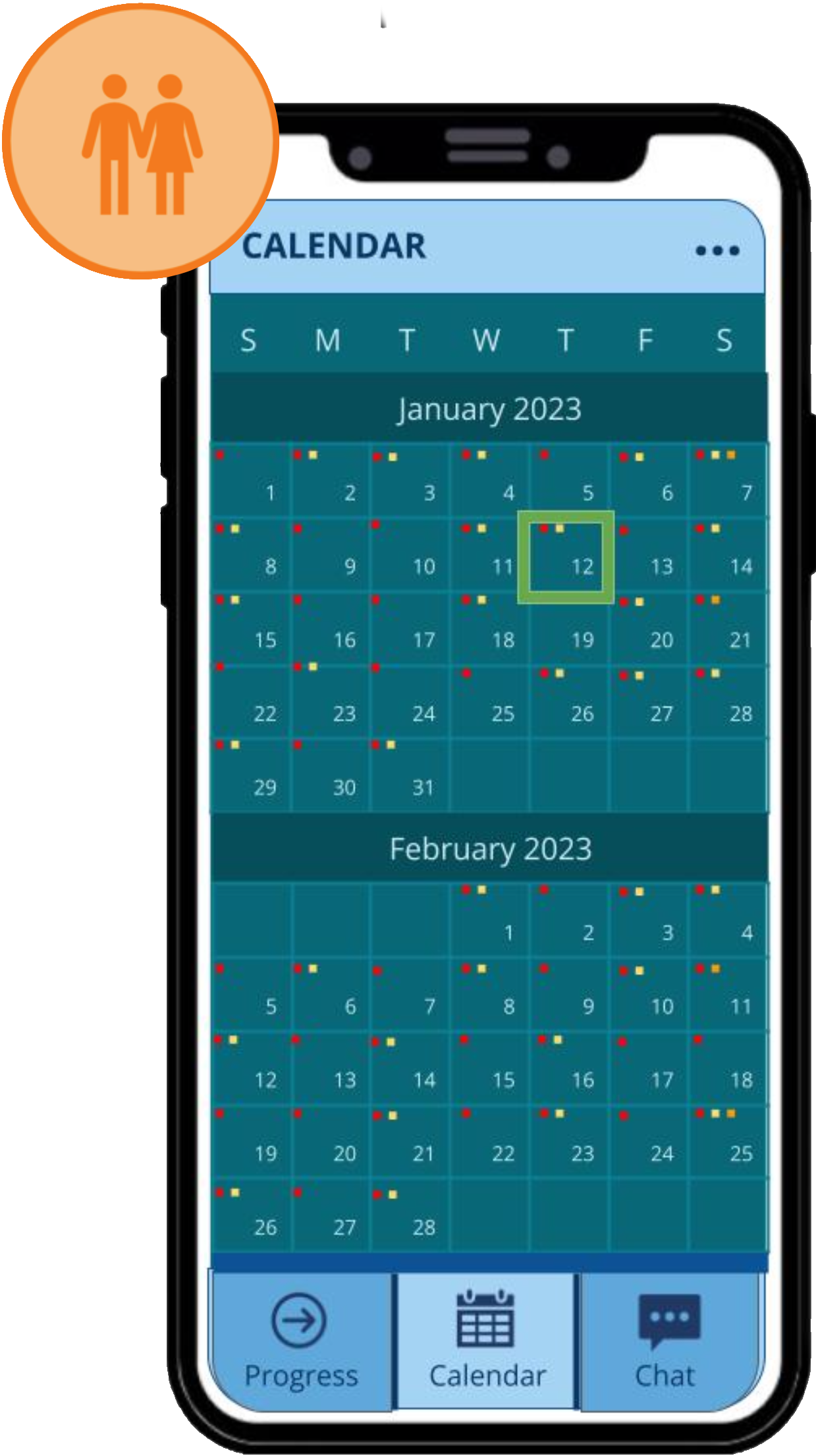
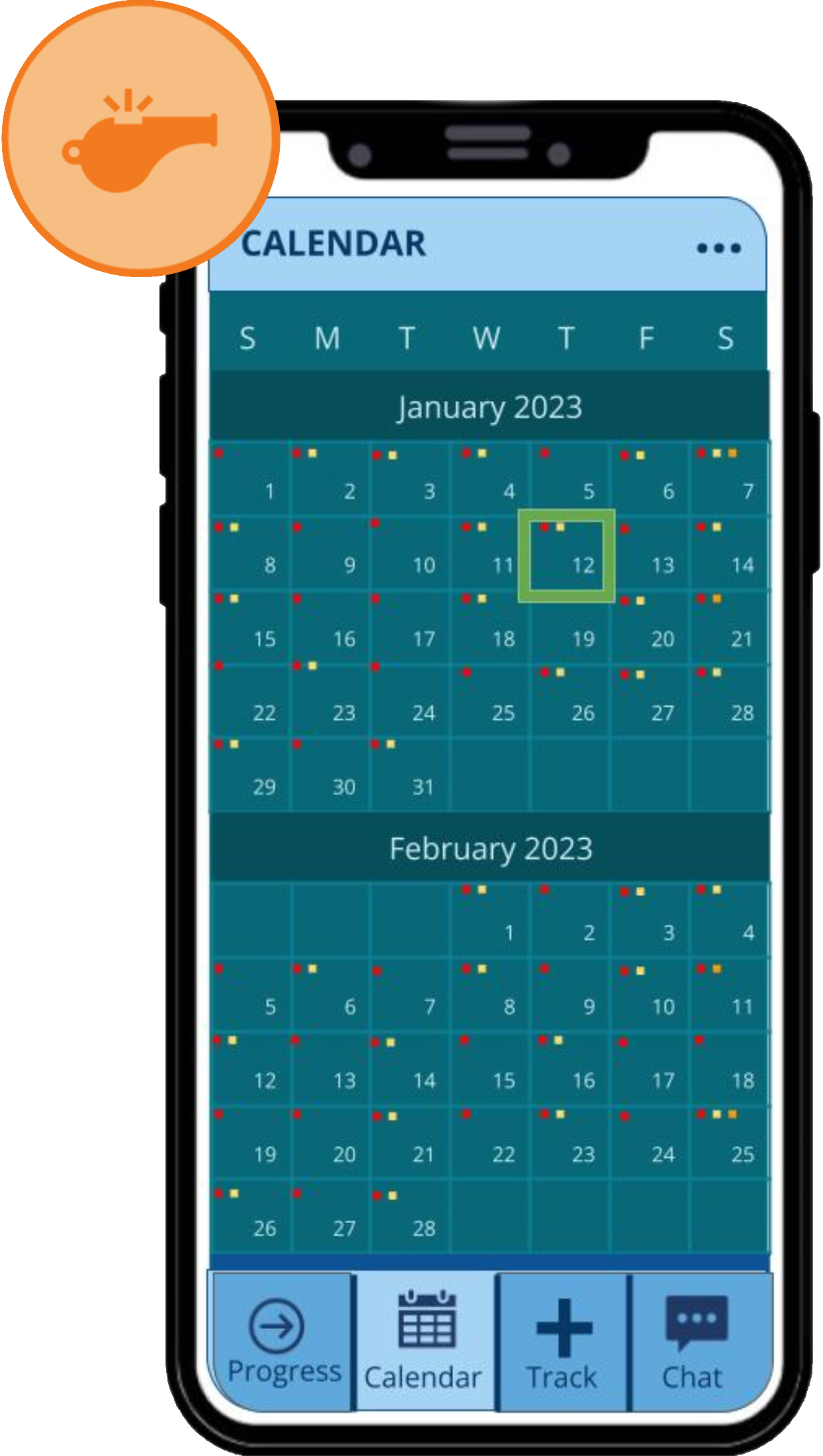
Color-coded dots will indicate the presence of calendar items on a particular day:
Red indicates meals
Yellow indicates exercise
Orange indicates meetings
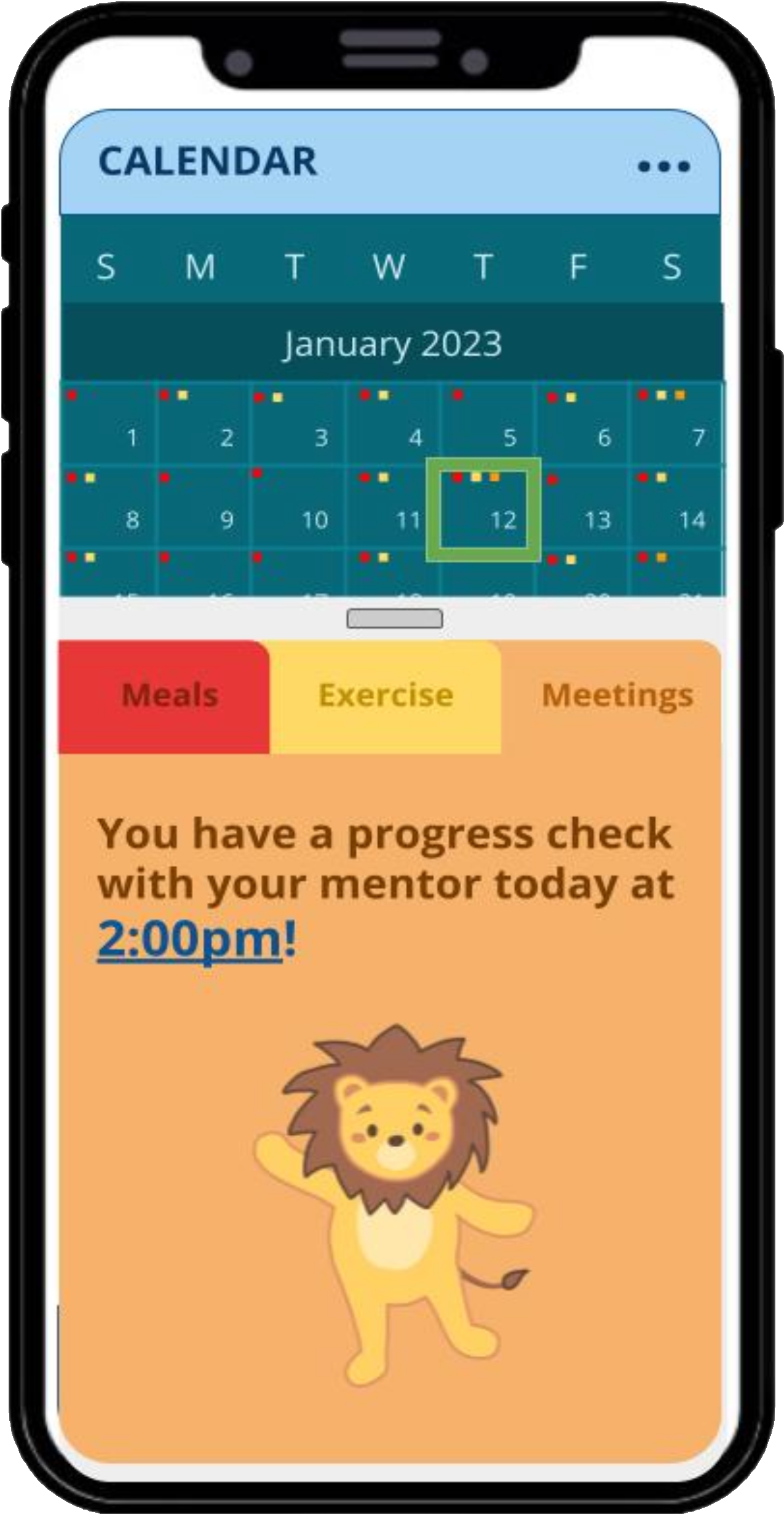
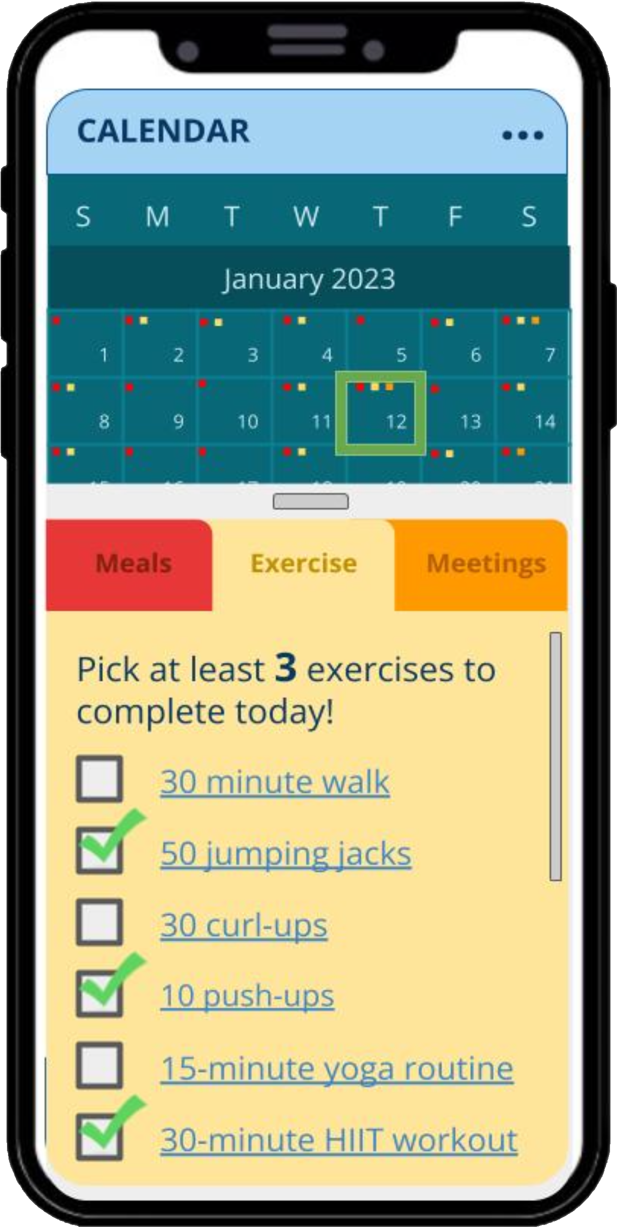
Calendar tab (expanded day) - same for Child, Parent, and Mentor
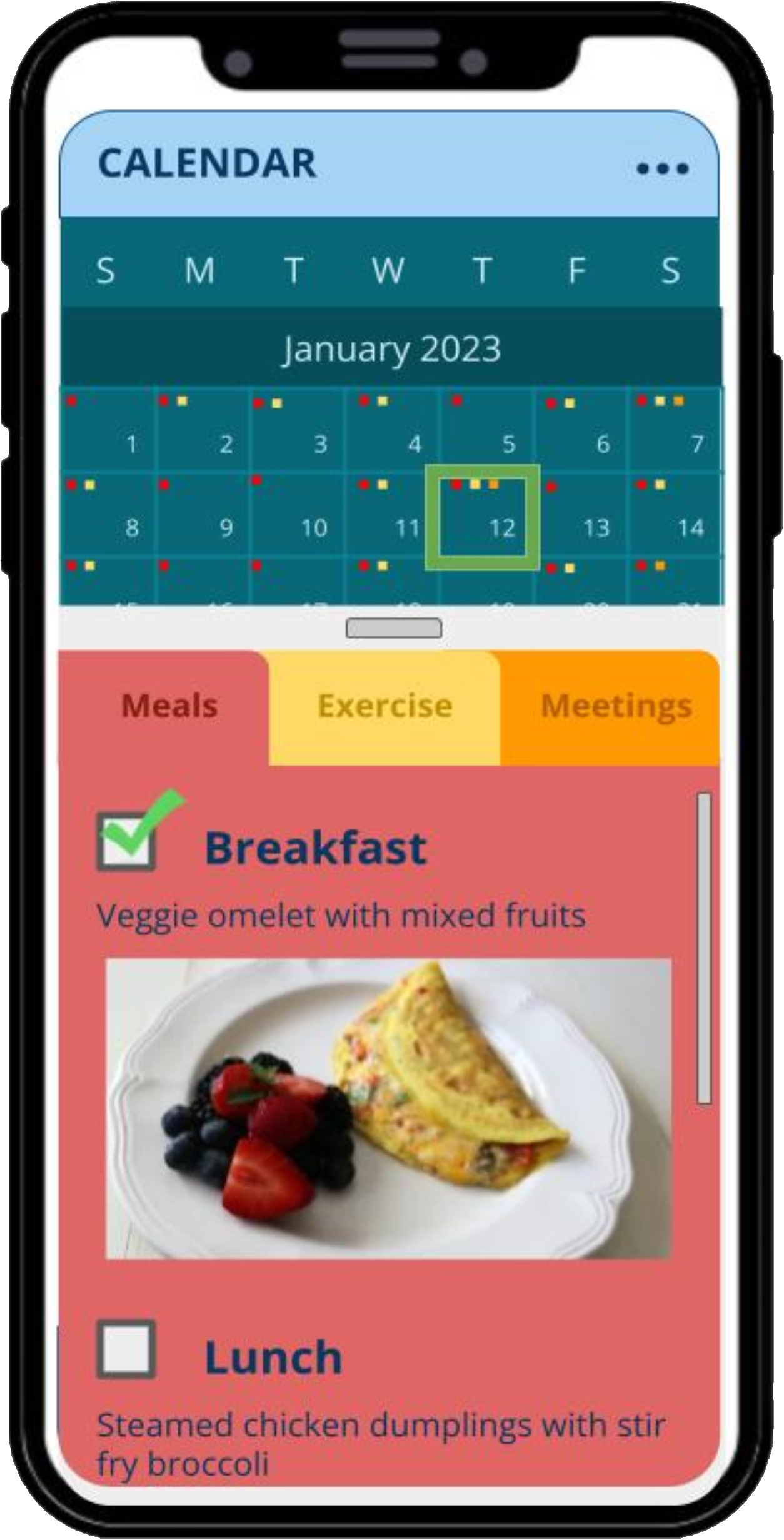
Daily meal recommendations with links to recipes
Comprehensive exercise list with links to tutorials
Scheduled check-in reminders with mentor
chat Tab
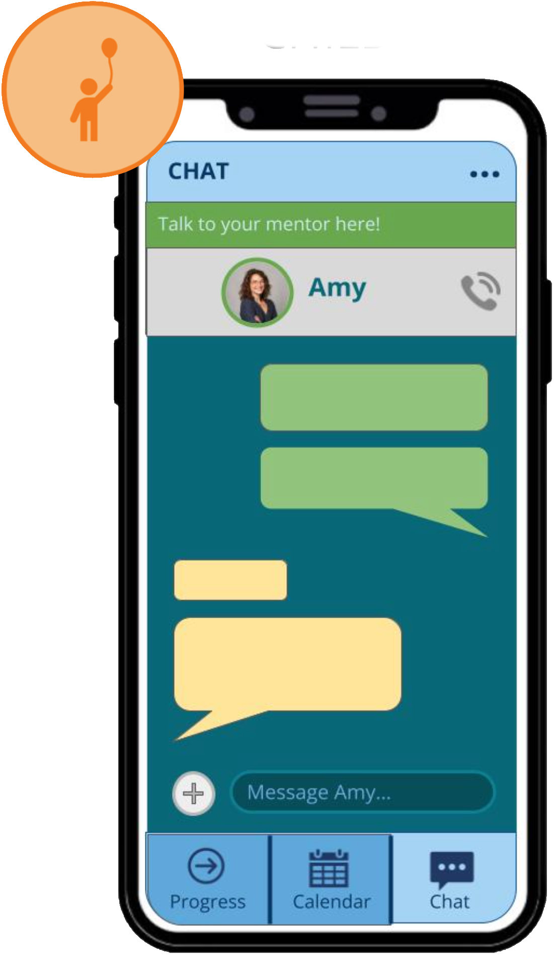
Child-to-Mentor
communication
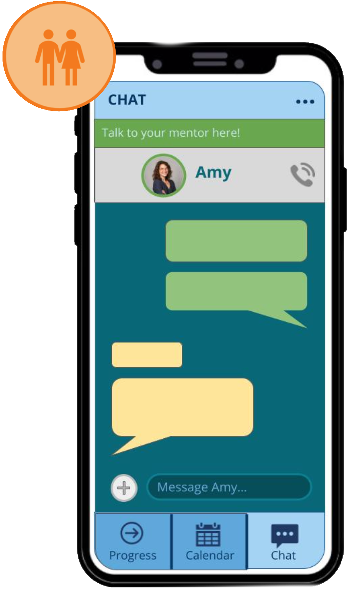
Parent-to-Mentor communication
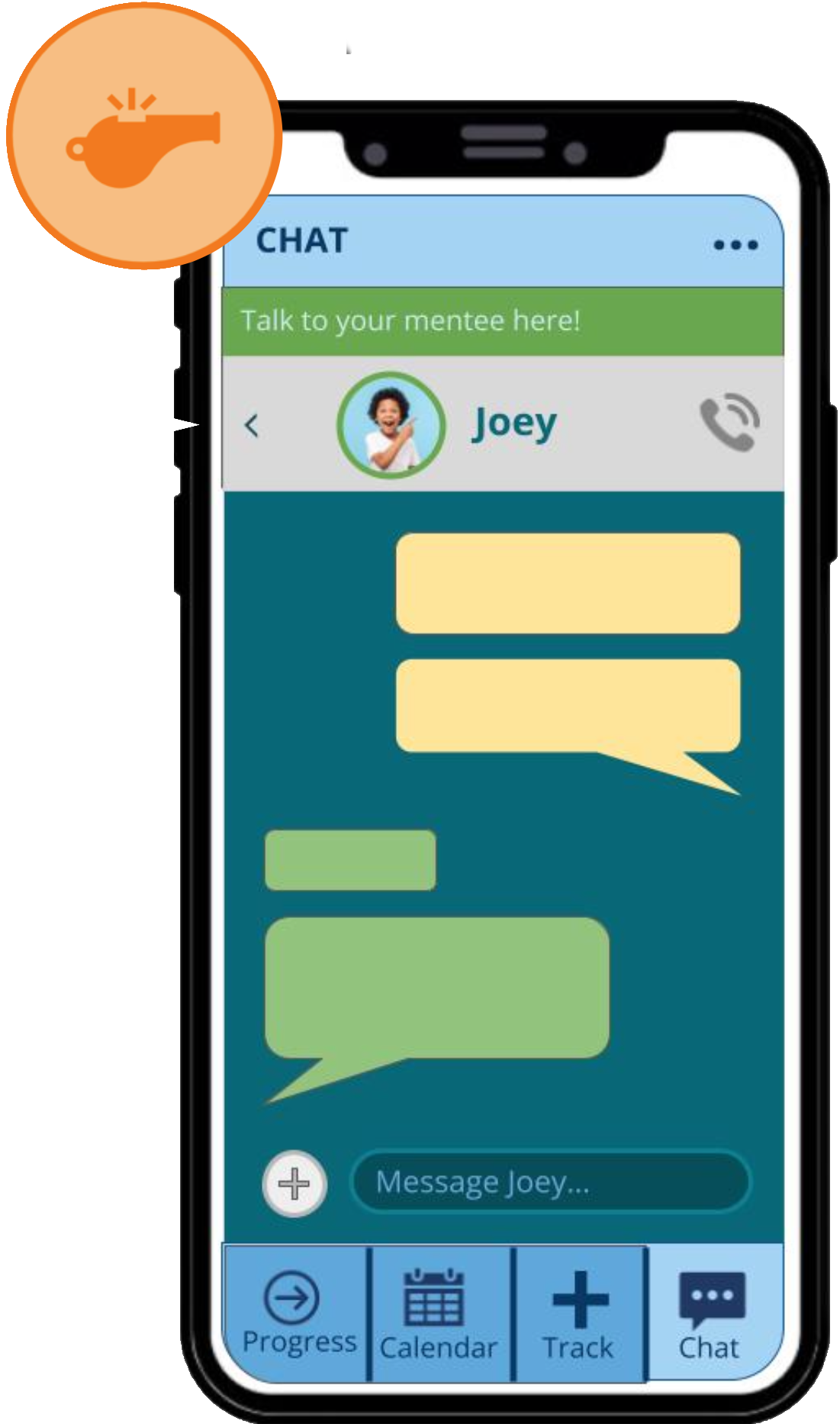
Mentor can communicate with both Child and Parent
All three modes include a video call feature
Mentor can toggle between multiple chats
track tab (Mentor only)
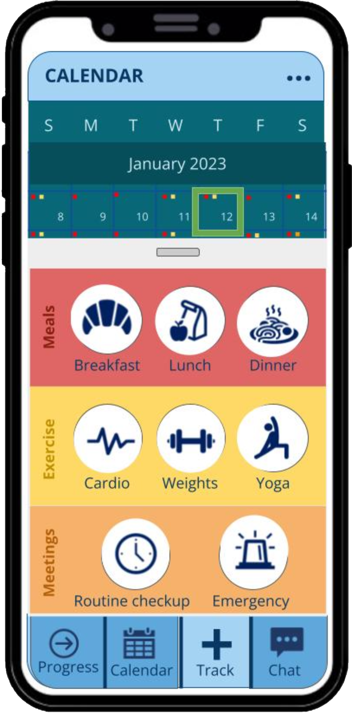
Mentor can add customized Meal, Exercise, and Meeting items to child’s calendar each day
key reflections
01
Integration of new features necessitates a comprehensive audit of the user journey, ensuring that each addition seamlessly contributes to the overarching goal of health empowerment.
Delving into the MilesToSmiles app was a transformative experience, marking Isabel and my first deep dive into user-centered design within the health and wellness space.
02
The paramountcy of usability cannot be overstated. When developing new components, the primary question remains: Does this simplify and add tangible value to the user's experience?
03
The synergy of cross-disciplinary collaboration is invaluable. The insights from various peers, including healthcare professionals, tech experts, and community members, have been instrumental in identifying core needs and tailoring the app to effectively meet them.